Wedding Invitation Maker App
- 0.0
- Rating
- 100.00K
- Installs
- Free
- Price
 Analysis by App-foxy
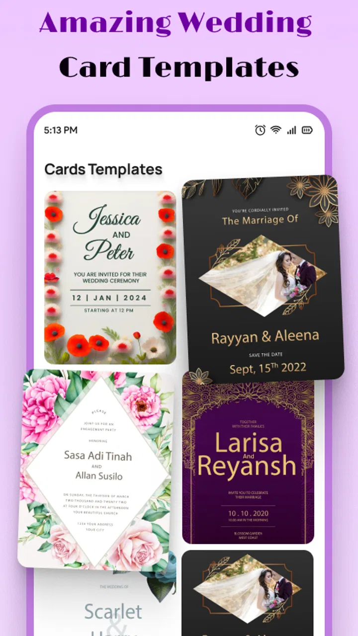
I approached Wedding Invitation Maker App with a simple task in mind: turn the basic details of a wedding into a card that feels personal enough to send to family and friends. That sounds easy, but invitation design usually becomes awkward when the wording, layout, and final handoff happen in separate places. This app, from EverestSol, is aimed at keeping that process focused on one job: creating a wedding card with text.
My overall impression is that it is most useful when you already know what you want to say and need a straightforward way to arrange it into an invitation. It is not the kind of tool I would choose for a complete wedding-planning project, guest management, or a highly art-directed stationery set. Its value is narrower, and that is also its appeal. You open it for the card, work through the wording and design, then move the finished result to the people who need it.
From wedding details to a shareable invitation
I find it helpful to decide early who will check the invitation and who will send the approved copy; that keeps design decisions from getting tangled with last-minute coordination. In this section, I look at how a focused card-making workflow can turn confirmed wedding details into a clear invitation, and why a careful handoff matters just as much as the finished design.
You May Also Like

 Blood Strike: 2.5 Anniversary
Blood Strike’s Loadouts Turn Every Drop Into a Tactical Gamble
A close look at Blood Strike’s custom loadouts: how fast access to signature weapons reshapes its battle royale rhythm, rewards preparation, and narrows the gap between fights.

 Pandora - Music & Podcasts
Pandora’s Music Is Easy to Start, but Harder to Recover
Pandora’s strength is its low-effort path from a seed to a station. Its weak spot is how much confidence it asks you to place in connection, setup, and quiet recovery.

 8 Ball Pool
 Is Built on Rivalries, Rematches, and Routine
A close look at the rivalries, rematches, shared routines, and unanswered safety questions that turn a quick pool match into a persistent mobile community.

 Samsung Music
’s Quiet Strength Is Playing What You Already Own
Its reach comes less from spectacle than from dependable access to a personal library. That simplicity is both the app’s strongest retention engine and its ceiling.

 AccuWeather: Weather Radar
AccuWeather Review: A Quick, Clear Forecast for Everyday Decisions
For everyday plans, the best forecast is the one you can understand quickly. AccuWeather makes rain timing, radar, and local conditions easy to act on, with a few trade-offs.

 Hill Climb Racing
Why Hill Climb Racing Still Turns Crashes Into One More Run
A tiny car, a bumpy hill and one more upgrade: Hill Climb Racing keeps resurfacing because its simple chaos makes every near-miss feel personal.
More From Our News Desk



Starting with the information that matters
The best way to use this app is to begin before touching the design. I would first write down the names, ceremony details, location, date, time, and any short note guests genuinely need. That preparation matters because a wedding invitation is not just decoration. A beautiful card with an incomplete address or confusing timing still creates work for everyone receiving it.
The app’s emphasis on text makes this preparation especially important. Instead of treating the card as a poster where every available space needs filling, I would decide which details deserve visual priority. The couple’s names should be easy to notice, while practical information such as the venue and schedule needs to remain readable. A short personal line can add warmth, but too much wording can make the design feel crowded.
This is one of the first useful trade-offs I noticed. A text-centered invitation maker can help me concentrate on the message rather than endlessly browsing decorative options. At the same time, it puts more responsibility on me to edit carefully. I would not paste a long announcement into the design and expect the layout to solve everything automatically. Shorter, cleaner wording gives the card a better chance of looking intentional.
Building the card step by step
The central workflow is easy to understand: create the wedding invitation, add the wording, and shape the card into something suitable for sharing. I found that the most reliable approach is to work in passes. First, I would enter the essential information without worrying about perfect spacing. Then I would review the order of the details. Only after that would I spend time making the card feel balanced.
That order prevents a common mistake. Many people start with styling, place the names in an attractive position, and only later discover that the venue or timing does not fit comfortably. By treating the text as the foundation, I can see early whether the invitation needs fewer words or a different arrangement. This is a small workflow improvement, but it makes the app more practical for real wedding preparation.
I also recommend reading the card as a guest rather than as the person who created it. A couple may understand an abbreviation or assume everyone knows the venue, while a distant relative may not. I would check whether the event information can be understood without a phone call. The app helps create the card, but it cannot replace that human review.
Making the invitation feel personal
A useful invitation does not need to sound formal just because it is connected to a wedding. I would use the design to support the couple’s tone: warm and simple for a small gathering, more traditional for a formal ceremony, or relaxed when the guest list is mostly close friends. The wording should lead the mood, with the visual treatment reinforcing it rather than competing with it.
One practical technique is to prepare two versions of the message before finalizing the card. The first can include every detail. The second can be a tighter version with only the information guests need immediately. Comparing them makes it easier to spot repeated phrases and unnecessary lines. In a text-based card maker, this editing step can make a bigger difference than adding another decorative element.
I would also keep the invitation readable on a smaller phone screen. Even if the design looks comfortable while editing, guests may open it quickly between other messages. Short lines, clear separation between sections, and a sensible order make the finished card easier to scan. This is particularly important when the card is being sent digitally rather than printed.
The handoff from creator to guests
Creating the card is only half of the real task. The next step is getting it from the person designing it to the people invited. That handoff can involve a partner checking the wording, a family member confirming the venue details, or someone else taking responsibility for sending the final version. I would treat the card as a shared document until those checks are complete.
Before sending it widely, I would show the finished invitation to at least one person who knows the event but was not involved in writing every line. Their role is not to judge the style; it is to catch missing information, awkward phrasing, or a detail that is visually easy to overlook. This is a realistic place where an app-based workflow benefits from a human checkpoint.
I would also keep one clearly identified final version. Wedding planning produces many small edits, and sending an earlier card after the time or venue changes can create confusion. The app is useful for producing the invitation, but version discipline still belongs to the user. Naming the final file or marking the approved design outside the app can prevent an avoidable mistake.
What the finished result is good at
When the wording is prepared and the design remains focused, the result can serve as a practical digital wedding invitation rather than just a decorative image. That makes the app a good fit for couples who want to create something themselves without committing to a larger design system. It can also suit a friend or relative helping with the invitation when the couple has already agreed on the message.
I see particular value in last-minute coordination. If the event details are settled but the invitation still needs to be assembled, a dedicated wedding card tool is more direct than opening a general presentation editor or trying to format text in a messaging app. The narrower purpose reduces the number of unrelated decisions. For a small ceremony, a civil wedding, or an informal celebration, that simplicity may be exactly what is needed.
It can also be useful when the invitation needs a personal touch that a plain text message would not provide. A designed card gives the announcement a sense of occasion, while the text keeps it functional. I would use it for a digital-first invitation where guests are likely to view the card on their phones and where the main goal is clear communication with a little character.
Where it compares well with usual alternatives
The usual alternatives fall into a few groups. A general graphic design editor may offer more control, but that flexibility can slow down someone who only wants a wedding invitation. A word processor is good for editing information, yet it rarely makes the final card feel like an event announcement without extra formatting work. A ready-made online invitation service may provide a more complete event workflow, but it can also introduce features that are unnecessary for a simple card.
This app sits closer to the focused end of that range. I would choose it over a general editor when I want to stay on task and avoid building a layout from an empty canvas. I would choose a broader design tool instead when the invitation needs a coordinated visual identity across menus, signs, thank-you cards, and other wedding materials. I would choose an event-management service when guest responses, attendance tracking, or organized updates are central to the plan.
That distinction is important because “better” depends on the handoff after design. If the finished card only needs to be reviewed and shared, a focused maker can be enough. If the card is one part of a much larger guest-management process, the app may feel like only one small piece of the job.
Where the workflow can break
The first weak point is content overload. No invitation maker can make a long, poorly prioritized message feel effortless. If I try to include directions, dress guidance, accommodation notes, registry information, meal choices, and a personal letter in one card, the result may become difficult to read. In that situation, I would keep the invitation concise and move extended information into a separate message or document.
The second weak point is review pressure. A card can look finished before it has been checked from a guest’s perspective. Names can be misspelled, times can be misunderstood, and a venue can be recognizable to the couple but not to visitors. I would never treat a polished appearance as proof that the invitation is ready. The final reading should be slow and practical, not just visual.
The third issue is that a focused card app is not automatically the best answer for every design expectation. If I wanted precise control over a complete visual system, I would probably move to a more advanced design application. That choice would bring more tools and more learning overhead, but it would also make sense for a formal stationery package. The simplicity that helps here can become limiting when the project expands.
There is also a handoff risk when several people are editing or approving the invitation. A couple may have different preferences about wording, while a family member may request extra information. I would settle the text first and design second, then ask for one final approval rather than collecting scattered changes throughout the process. This keeps the app from becoming the place where every disagreement is negotiated.
Compatibility, cost, and who should use it
The app is free, carries an Everyone content rating, and works on Android devices running version 6.0 or later. Its current version is 1.10, and it has passed the 100K-install mark. Those details make it approachable for someone who wants to try the workflow without making the invitation project a paid commitment, while the broad age rating suits a family member helping with the design.
I would recommend it to couples who want a dedicated wedding invitation maker, people preparing a small or informal event, and relatives handling the card on behalf of someone else. It is also a sensible starting point for anyone who feels that a full design editor would be excessive for one invitation. The app’s focused purpose means I can spend more energy checking the message and less time learning an unrelated tool.
I would skip it when the main requirement is not the card itself. Couples who need a complete RSVP process, guest-list management, coordinated stationery, or elaborate brand-like control should look toward a broader solution. I would also hesitate if the invitation requires a highly specific visual style that depends on advanced editing rather than text arrangement and card design.
My practical routine for using it
My preferred routine would begin with a plain-text draft saved outside the design stage. I would confirm the event details with the other person responsible for the wedding, then enter only the approved wording into the card. After arranging the information, I would read it once for accuracy and once for tone. This two-pass method separates factual checking from aesthetic judgment.
Next, I would ask someone uninvolved in the editing to inspect the card as a guest. I would specifically ask them to find the date, time, location, and any instruction without prompting. If they hesitate, I would simplify the wording or improve the visual order rather than assuming they missed something obvious.
Finally, I would approve one version and use that version for the handoff. If the invitation is being sent in stages, I would keep the message consistent so that different guests do not receive conflicting wording. This routine is not a flashy feature, but it is one of the strongest ways to get dependable results from a simple invitation tool.
My final view after following the full workflow
Wedding Invitation Maker App works best when I treat it as a focused production tool: prepare the details, write a concise message, shape the card, review it with another person, and then share the approved result. Its strength is the direct path from wedding information to a designed invitation. It does not need to become a complete planning platform to be useful.
The limitations are equally clear. The app cannot decide which details matter, catch every factual mistake, or replace a larger design and event-management system when the wedding demands one. Those are not reasons to dismiss it; they simply define the situations where it fits. For a couple or helper who wants a free, accessible way to make a wedding card with text, I think it is worth trying.
My recommendation is to use it when clarity and a personal digital card matter more than advanced control. Start with the words, keep the layout readable, involve one independent reviewer, and treat the final handoff as part of the invitation process. Used that way, the app can remove much of the friction from a small but important wedding task without pretending to solve everything around it.
FAQs for Wedding Invitation Maker App
01What features does the Wedding Invitation Maker App offer?
The Wedding Invitation Maker App provides a variety of customizable templates suitable for different wedding themes. Users can personalize invitations by adding text, images, and decorative elements. The app also includes features for managing guest lists, sending digital invitations, and tracking RSVPs. Additionally, it offers options to share invitations via social media or email.
02Is the Wedding Invitation Maker App user-friendly for beginners?
Yes, the app is designed with an intuitive interface, making it accessible for users with no prior design experience. It offers step-by-step guidance and tutorials to assist in creating invitations. Drag-and-drop functionality and easy-to-navigate menus ensure that even beginners can craft professional-looking invitations with ease.
03Can I print invitations made with the Wedding Invitation Maker App?
Absolutely. The app allows users to export their invitations in high-resolution formats suitable for printing. You can choose from various sizes and paper types to match your specific needs. Many users find that printing at home or using a professional service yields excellent results, preserving the quality of the design.
04Does the app support collaboration with my partner or wedding planner?
Yes, the app includes features that support collaboration. You can share your designs with others for feedback or editing through a secure link. This makes it convenient to involve your partner or wedding planner in the design process, ensuring the invitation meets everyone's expectations.
05Are there any costs associated with using the Wedding Invitation Maker App?
The app offers a free version with basic features, but premium templates and advanced functionalities may require a subscription or one-time purchase. It's advisable to review the pricing details within the app to determine if the free version meets your needs or if upgrading would be beneficial for your wedding planning.
Pros
- User-friendly interface for quick design.
- Wide range of customizable templates.
- High-quality graphics and fonts available.
- Easy sharing via social media and email.
- Supports multiple languages for invitations.
Cons
- Limited free template options.
- Premium features require in-app purchases.
- Occasional ads can be disruptive.
- Lacks offline editing capabilities.
- Some templates have watermark restrictions.

Wedding Invitation Maker App
Gallery